

choco's story
CSS 12. flexbox 2 본문
flexbox 관련 속성
flexbox는 아래와 같은 속성들을 함께 사용할 수 있습니다.
- 주축 배치 : justify-content
- 교차축 배치 : align-items
- 교차축 개별 요소 배치 : align-self
- 줄바꿈 여부 : flex-wrap
하나씩 살펴보도록 하겠습니다.
flexbox의 justify-content
justify-content 란?
: flex 컨테이너 내에서 요소들이 배치되는 주축(main-axis)을 기준으로 어떻게 정렬할지를 지정해 주는 속성
flex-direction을 통해 주축(main-axis)으로 배치되는 요소들을 어떻게 정렬할지 따로 또 세부적으로 설정하는 속성이 justify-content 입니다.
justify-content는 아래와 같은 5개의 속성값을 가집니다.
flex-start | flex-end | center | space-between | space-around하나씩 살펴보도록 하겠습니다.
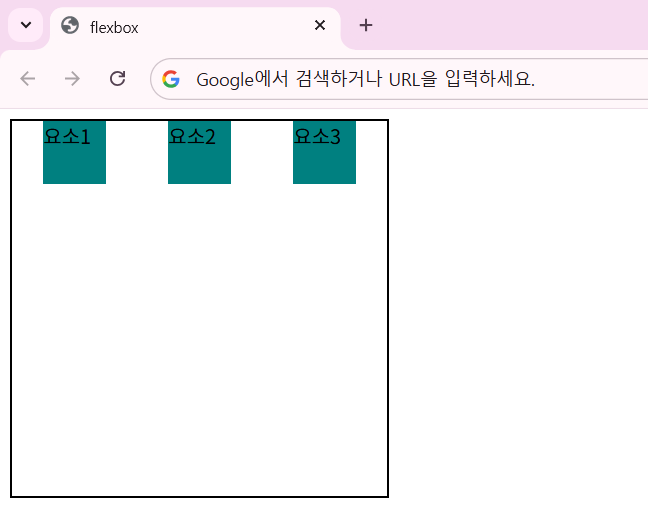
justify-content: flex-start;
justify-content 예시
<!doctype html>
<html lang="en">
  <head>
    <meta charset="UTF-8" />
    <meta name="viewport" content="width=device-width, initial-scale=1.0" />
    <title>flexbox</title>
    <style>
      .container {
        display: flex;
        width: 300px;
        height: 300px;
        border: 2px solid black;
        justify-content: flex-start;
      }
      .item {
        width: 50px;
        height: 50px;
        background-color: teal;
      }
    </style>
  </head>
  <body>
    <div class="container">
      <div class="item">요소1</div>
      <div class="item">요소2</div>
      <div class="item">요소3</div>
    </div>
  </body>
</html>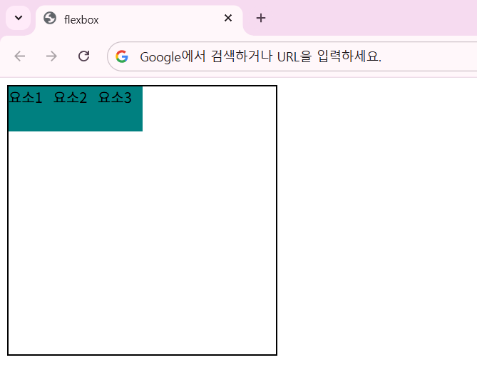
justify-content: flex-start;는 기본값이고 왼쪽부터 순서대로 정렬해줍니다.
다른 속성값을 넣으면 어떻게 될까요?
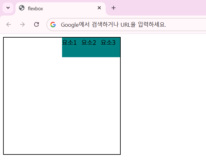
justify-content: flex-end;
.container {
  display: flex;
  width: 300px;
  height: 300px;
  border: 2px solid black;
  justify-content: flex-end;
}
justify-content: center;
.container {
  display: flex;
  width: 300px;
  height: 300px;
  border: 2px solid black;
  justify-content: center;
}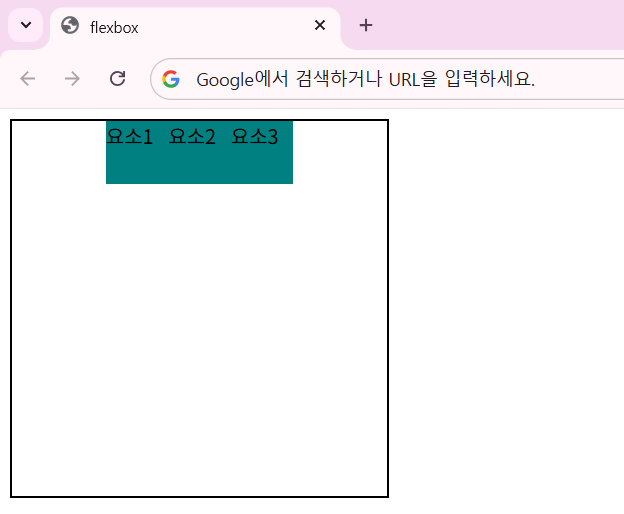
flex-end와 center 속성값은 가장 오른쪽 끝에, 너비의 가운데에 각각 정렬해줍니다.
justify-content: space-between;
.container {
  display: flex;
  width: 300px;
  height: 300px;
  border: 2px solid black;
  justify-content: space-between;
}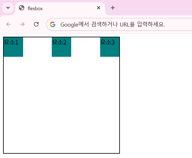
space-between 속성값은 요소 중 양 끝에 있는 것들을 왼쪽과 오른쪽 끝에 붙인 후, 그 사이 요소들의 간격을 일정하게 재배치합니다.
justify-content: space-around;
.container {
  display: flex;
  width: 300px;
  height: 300px;
  border: 2px solid black;
  justify-content: space-around;
}
space-around 속성값은 space-between 과 비슷해보입니다.
그러나 between은 양 끝에 요소를 붙인 후 일정한 간격으로 요소들을 배열하지만, space-around는 양 끝에 붙이지 않고 요소 사이사이 간격을 일정하게 배치만 합니다.
flexbox의 align-items
align-items 이란?
: flex 컨테이너 내에서 요소들이 배치되는 교차축(cross-axis)을 기준으로 어떻게 정렬할지를 지정해 주는 속성
flex-direction을 통해 교차축(cross-axis)으로 배치되는 요소들을 어떻게 정렬할지 따로 또 세부적으로 설정하는 속성이 align-items 입니다.
align-items는 아래와 같은 5개의 속성값을 가집니다.
flex-start | flex-end | center | baseline | stretch하나씩 살펴보도록 하겠습니다.
align-items: flex-start;
align-items 예시
<!doctype html>
<html lang="en">
  <head>
    <meta charset="UTF-8" />
    <meta name="viewport" content="width=device-width, initial-scale=1.0" />
    <title>flexbox</title>
    <style>
      .container {
        display: flex;
        width: 300px;
        height: 300px;
        border: 2px solid black;
        align-items: flex-start;
      }
      .item {
        width: 50px;
        height: 50px;
        background-color: teal;
      }
    </style>
  </head>
  <body>
    <div class="container">
      <div class="item">요소1</div>
      <div class="item">요소2</div>
      <div class="item">요소3</div>
    </div>
  </body>
</html>
align-items: flex-start;는 기본값이고 위에서부터 순서대로 정렬해줍니다.
다른 속성값을 넣으면 어떻게 될까요?
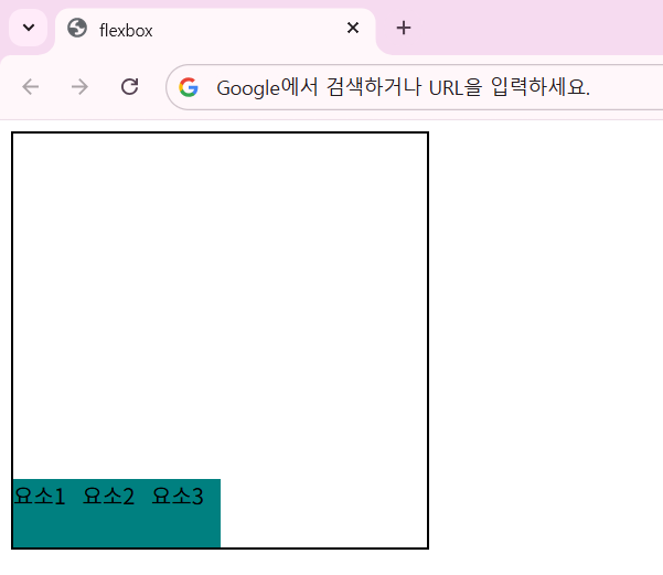
align-items: flex-end;
.container {
  display: flex;
  width: 300px;
  height: 300px;
  border: 2px solid black;
  align-items: flex-end;
}
align-items: center;
.container {
  display: flex;
  width: 300px;
  height: 300px;
  border: 2px solid black;
  align-items: center;
}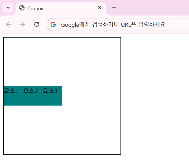
flex-end와 center 속성값은 맨 아래에, 높이의 가운데에 각각 정렬해줍니다.
align-items: baseline;
<!doctype html>
<html lang="en">
  <head>
    <meta charset="UTF-8" />
    <meta name="viewport" content="width=device-width, initial-scale=1.0" />
    <title>flexbox</title>
    <style>
      .container {
        display: flex;
        width: 500px;
        height: 300px;
        border: 2px solid black;
        align-items: baseline;
      }
      .item {
        background-color: teal;
        color: white;
        margin: 5px;
      }

      .item1 {
        height: 100px;
        font-size: 20px;
      }
      .item2 {
        height: 150px;
        font-size: 50px;
      }
      .item3 {
        height: 80px;
        font-size: 30px;
      }
    </style>
  </head>
  <body>
    <div class="container">
      <div class="item item1">요소1</div>
      <div class="item item2">요소2</div>
      <div class="item item3">요소3</div>
    </div>
  </body>
</html>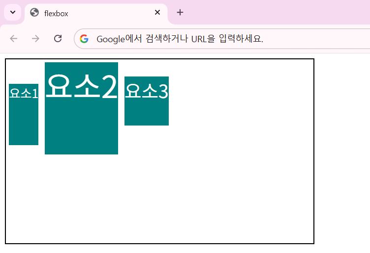
align-items: baseline 속성값은 요소가 기준이 되는 정렬이 아니라, 내부 텍스트의 기준선(baseline)을 기준으로 정렬하게 해줍니다.
즉, 박스 외곽선이 아니라 안쪽의 텍스트 내용물이 기준이 되는 속성값입니다.
align-items: stretch;
<!doctype html>
<html lang="en">
  <head>
    <meta charset="UTF-8" />
    <meta name="viewport" content="width=device-width, initial-scale=1.0" />
    <title>flexbox</title>
    <style>
      .container {
        display: flex;
        width: 300px;
        height: 300px;
        border: 2px solid black;
        align-items: stretch;
      }
      .item {
        width: 50px;
        /* height: 50px; */
        background-color: teal;
      }
    </style>
  </head>
  <body>
    <div class="container">
      <div class="item">요소1</div>
      <div class="item">요소2</div>
      <div class="item">요소3</div>
    </div>
  </body>
</html>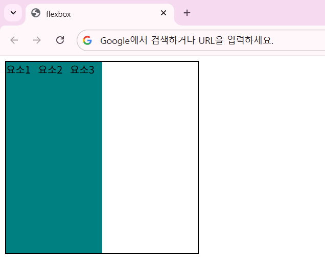
align-items: stretch는 교차축 방향으로 여유 공간이 있으면 요소들을 끝까지 채우도록 하는 속성값입니다.
자식 요소가 고정 높이값이 없다면 부모 요소의 높이만큼 채우고, 만약 고정 높이값이 있다면 이를 우선으로 따릅니다.
flexbox의 align-self
<!doctype html>
<html lang="en">
  <head>
    <meta charset="UTF-8" />
    <meta name="viewport" content="width=device-width, initial-scale=1.0" />
    <title>flexbox</title>
    <style>
      .container {
        display: flex;
        width: 300px;
        height: 300px;
        border: 2px solid black;
        justify-content: center;
      }
      .item {
        width: 50px;
        height: 50px;
        background-color: teal;
      }
      .self {
        align-self: flex-end;
      }
    </style>
  </head>
  <body>
    <div class="container">
      <div class="item">요소1</div>
      <div class="item self">요소2</div>
      <div class="item">요소3</div>
    </div>
  </body>
</html>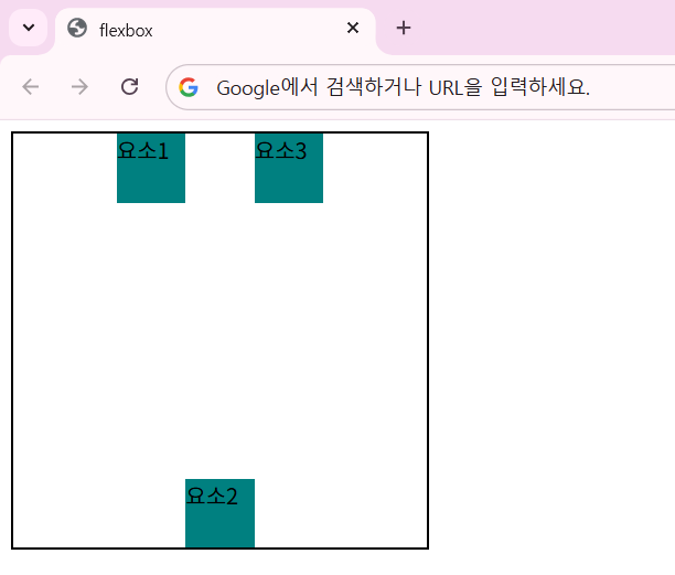
item 요소들을 justify-content: center 속성값으로 나열했는데, self 클래스를 가진 요소2만 align-self: flex-end를 부여했습니다.
그랬더니 해당 요소만 맨 아래로 이동했습니다.
이렇게 align-self는 특정 요소만 정렬 방식을 바꿀 때 사용합니다.
flexbox의 flex-wrap
flex-wrap 이란?
: 개별 요소들의 도합 크기가 컨테이너의 주축 길이보다 커졌을 때 어떻게 해야할 지 처리 방법 및 방향을 정의하는 속성
flex 요소 내에서 각 요소들의 크기가 초과하면, flex는 요소들의 크기를 줄여버립니다.
<!doctype html>
<html lang="en">
  <head>
    <meta charset="UTF-8" />
    <meta name="viewport" content="width=device-width, initial-scale=1.0" />
    <title>flexbox</title>
    <style>
      .container {
        display: flex;
        width: 300px;
        height: 300px;
        border: 2px solid black;
        justify-content: center;
      }
      .item {
        width: 50px;
        height: 50px;
        background-color: teal;
      }
    </style>
  </head>
  <body>
    <div class="container">
      <div class="item">요소1</div>
      <div class="item">요소2</div>
      <div class="item">요소3</div>
      <div class="item">요소4</div>
      <div class="item">요소5</div>
      <div class="item">요소6</div>
      <div class="item">요소7</div>
      <div class="item">요소8</div>
    </div>
  </body>
</html>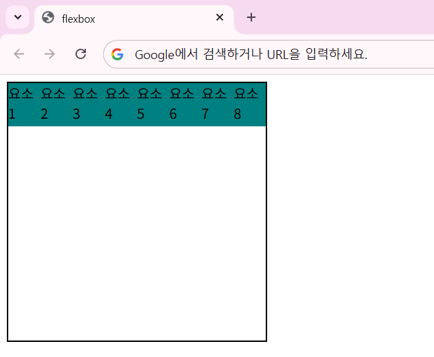
요소들의 개수가 늘어나면 flex 컨테이너는 해당 요소들의 크기를 계속 줄이면서 배치합니다.
이를 다음 줄로 넘겨서 배치하려면 flex-wrap 속성값이 필요합니다.
.container {
  display: flex;
  width: 300px;
  height: 300px;
  border: 2px solid black;
  justify-content: center;
  flex-wrap: nowrap;
}
기본값은 nowrap입니다.
이 속성값은 다음 줄로 배치하는 기능을 무시합니다.
.container {
  display: flex;
  width: 300px;
  height: 300px;
  border: 2px solid black;
  justify-content: center;
  flex-wrap: wrap;
}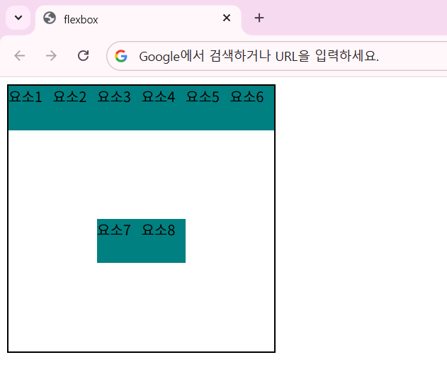
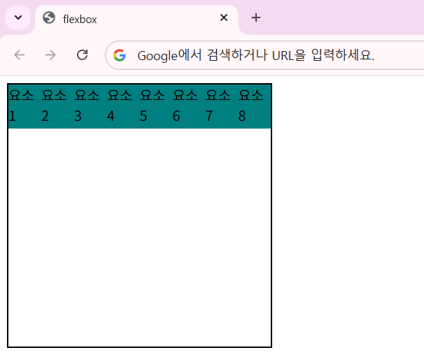
flex-wrap: wrap 속성값은 요소들의 배치가 한 줄의 공간이 부족하면, 한 줄을 초과하지 않도록 감싸서(wrap) 다음 줄로 넘어가도록 설정합니다.
.container {
  display: flex;
  width: 300px;
  height: 300px;
  border: 2px solid black;
  justify-content: center;
  flex-wrap: wrap-reverse;
}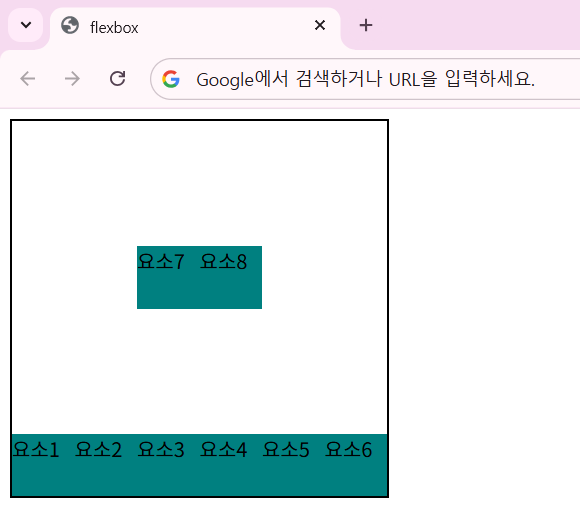
flex-wrap: wrap-reverse 속성값은 wrap과 동일하지만, 줄이 쌓이는 방향은 반대가 됩니다.
(시작하는 줄부터 끝나는 줄이 쌓이는 방향이 반대)
'HTML & CSS > CSS' 카테고리의 다른 글
| CSS 14. 의사 클래스 (가상 클래스) (0) | 2026.05.22 |
|---|---|
| CSS 13. 선택자 - 특성 선택자, 결합 선택자 (0) | 2026.05.21 |
| CSS 11. flexbox 1 (0) | 2026.05.20 |
| CSS 10. position (0) | 2026.05.19 |
| CSS 09. float, clear (0) | 2026.05.19 |