

choco's story
CSS 11. flexbox 1 본문
flexbox
flexbox 란?
박스 내 요소 간의 공간 배분과 정렬 기능을 제공하기 위한 1차원 레이아웃 모델
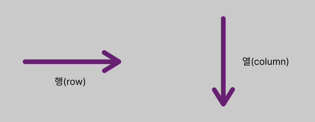
여기서 flexbox를 1차원 모델이라 부르는 이유는, 레이아웃을 다룰 때 한 번에 하나의 차원만 다루기 때문입니다.
즉 한 번에 행, 또는 열 하나만 다룹니다. (동시에 X)
flexbox 만들기
flexbox는 flex 컨테이너라고도 불립니다. (= 요소들을 포함)
flexbox를 만들기 위해선, 컨테이너가 되는 요소에 display: flex;를 적용하면 됩니다.
ex)
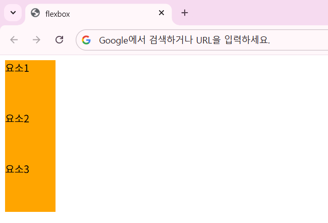
flexbox 적용 전...
<div>
  <div class="item">요소1</div>
  <div class="item">요소2</div>
  <div class="item">요소3</div>
</div>
flexbox 적용 후
<div style="display: flex">
  <div class="item">요소1</div>
  <div class="item">요소2</div>
  <div class="item">요소3</div>
</div>
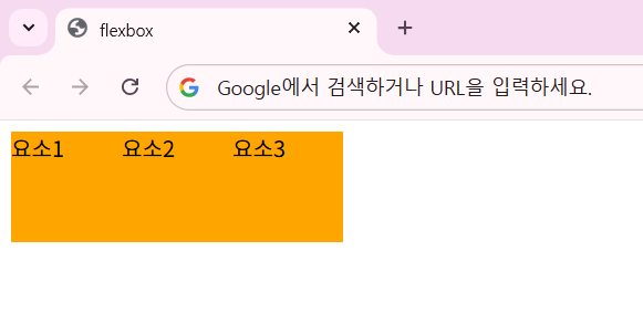
각 요소가 개별로 취급되어 위에서부터 하나씩 쌓이던 것을 display: flex; 속성을 추가하여 하나의 컨테이너로 취급되고 나란히 배치되게 하였습니다.
flex-direction
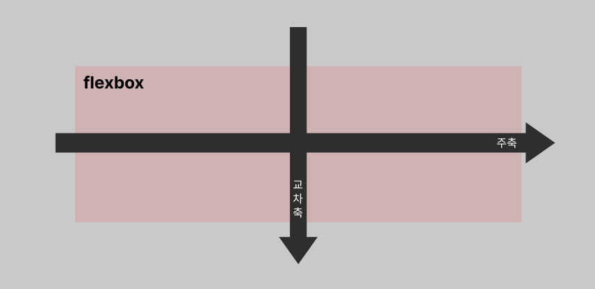
flexbox에는 "주축(main-axis)"과 "교차축(cross-axis)"이 있습니다.
flex-direction 이란?
: flexbox 내 요소를 배치할 때 사용할 주축과 방향(정방향, 역방향)을 지정하는 속성
| 속성값 | 의미 |
|---|---|
| row | 기본값, 주축은 행이고 방향은 콘텐츠의 방향과 동일   |
| row-reverse | 주축은 행이고 방향은 콘텐츠의 방향과 반대 |
| column | 주축은 열이고 방향은 콘텐츠의 방향과 동일 |
| column-reverse | 주축은 열이고 방향은 콘텐츠의 방향과 반대 |
flex-direction 예시
<!doctype html>
<html lang="en">
  <head>
    <meta charset="UTF-8" />
    <meta name="viewport" content="width=device-width, initial-scale=1.0" />
    <title>flexbox</title>
    <style>
      .container {
        display: flex;
        /* row = 행, column = 열 */
        flex-direction: row;
      }
      .item {
        width: 80px;
        height: 80px;
        background-color: pink;
      }
    </style>
  </head>
  <body>
    <div class="container">
      <div class="item">1</div>
      <div class="item">2</div>
      <div class="item">3</div>
    </div>
  </body>
</html>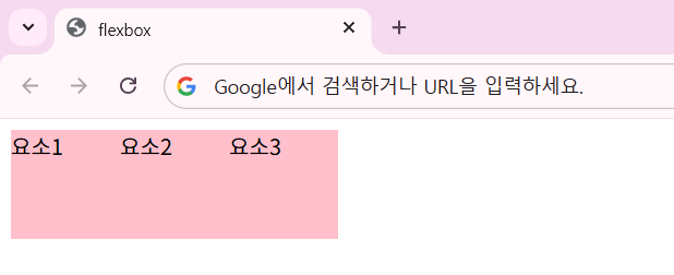
기본값인 flex-direction: row; 속성일 때의 결과입니다.
이제 flex-direction 속성을 다른 것들로 하나씩 바꿔보도록 하겠습니다.
.container {
  display: flex;
  /* row = 행, column = 열 */
  flex-direction: row-reverse;
}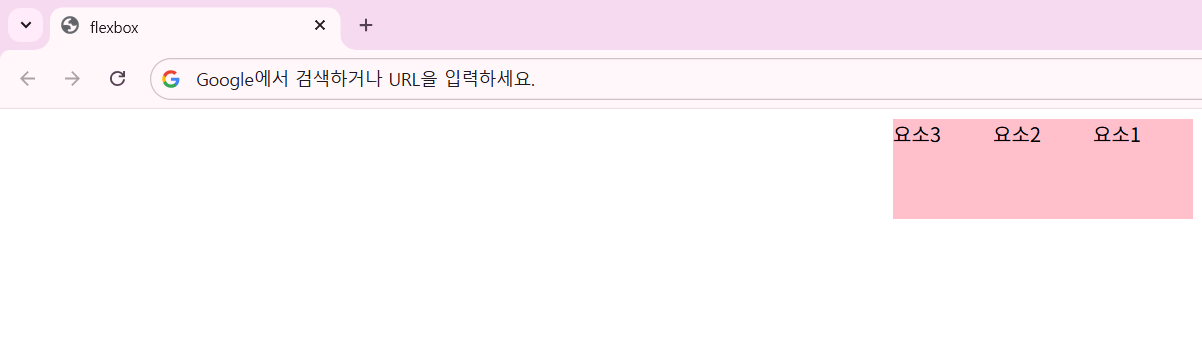
flex-direction: row-reverse 속성으로 바꿨더니, 요소가 오른쪽부터 반대 방향으로 나열됩니다.
.container {
  display: flex;
  /* row = 행, column = 열 */
  flex-direction: column;
}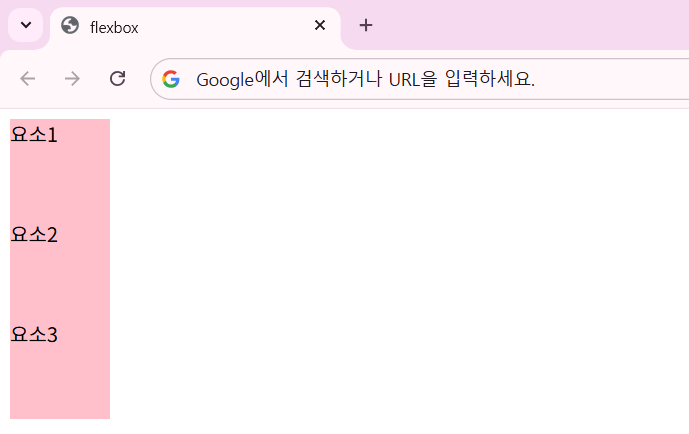
flex-direction: column 속성은 교차축 방향으로 요소들이 나열됩니다.
.container {
  display: flex;
  /* row = 행, column = 열 */
  flex-direction: column-reverse;
}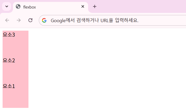
flex-direction: column-reverse 속성으로 바꾸니, 기존의 요소들이 거꾸로 나열되는 것을 확인할 수 있습니다.
'HTML & CSS > CSS' 카테고리의 다른 글
| CSS 13. 선택자 - 특성 선택자, 결합 선택자 (0) | 2026.05.21 |
|---|---|
| CSS 12. flexbox 2 (0) | 2026.05.20 |
| CSS 10. position (0) | 2026.05.19 |
| CSS 09. float, clear (0) | 2026.05.19 |
| CSS 08. 박스 모델 (Box-Model) - 4 (0) | 2026.05.18 |